What Is The Pantone Matching System (PMS) And How Is It Used in Printing?
The Pantone Matching System helps brands keep colours perfect in every print. Learn how PMS works, why it matters, and how it brings consistency, beauty, and trust to packaging and design across all industries.

Emily Parker
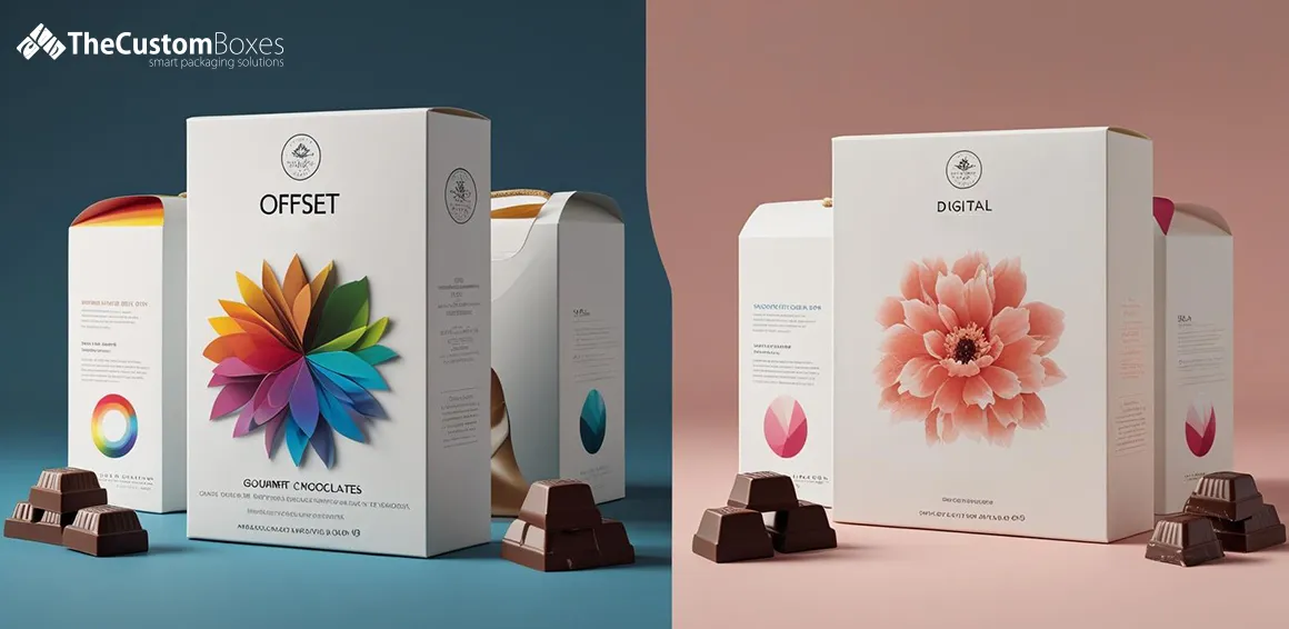
, and How Is It Used in Printing.webp)
Colours are the lifeline of a brand. A single wrong shade can harm trust, while the right match makes a brand unforgettable. That’s why global firms rely on the PMS system to ensure colours stay consistent across packaging, billboards, and more. Research shows brand recognition can rise by 80% with consistent colours. Imagine grabbing your favourite soda only to see its iconic red faded—it feels wrong. With over 2,161 standardised shades, many beyond CMYK’s range, Pantone PMS protects brands from such risks and guarantees flawless printing.
In this blog, we will explore how PMS colour matching strengthens brand identity. From keeping designs consistent across every medium to building trust with customers, PMS ensures colours always look the way they were intended. We will also discuss why businesses, designers, and printers prefer PMS over traditional systems and how this accuracy gives brands a strong competitive edge.
What Is the Pantone Matching System (PMS)?
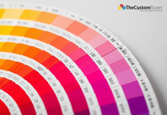
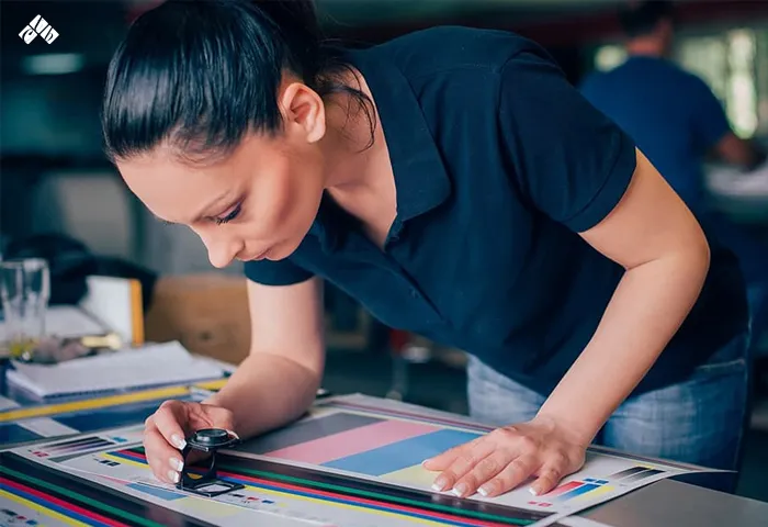
The Pantone system of matching colour is the one common language of colour. Each shade gets its own PMS code. This code is the same for printers in the USA, Europe, or Asia. It helps designers and manufacturers talk about colours without confusion. The PMS guide is made of swatches that show exactly how the colour will look when printed. Printers use these swatches to mix special inks that match the chosen PMS colour exactly. PMS colours are mixed before printing. This is why PMS gives better accuracy, especially for logos or special custom-printed boxes.


Benefits Of Pantone Colours
Using Pantone colours gives brands control over their look. First, PMS colours are consistent. A blue brand in New York will look the same in Tokyo. Second, PMS offers a huge Pantone colour range, including bright and metallic shades. Third, PMS printing is better for large solid colour areas. In packaging, solid colours can look patchy with CMYK, but PMS gives a clean finish. Also, PMS can save money when printing a small number of colours instead of full-colour CMYK. Brands with one or two key colours can use PMS inks for better quality.
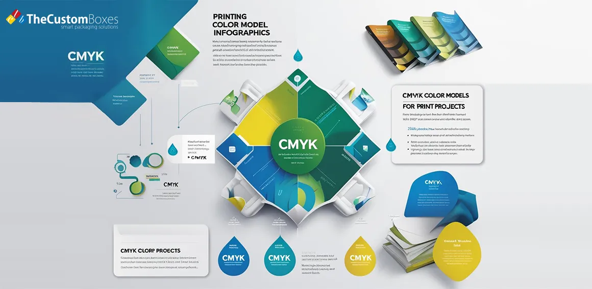
PMS vs. CMYK: What’s The Difference?
Some inks blend on paper to make many colours. However, CMYK can only match about 55% of PMS colours exactly. This means if you choose a colour from the colour PMS guide that is outside CMYK’s range, the print may not look right. PMS uses pre-mixed inks, so the result is exact. In packaging design, this is critical. An example is a luxury in which the brand is lettered in gold and requires metallic PMS inks since CMYK cannot produce real metallics. Both systems may be used alongside one another by printers, with PMS spot colours being used in CMYK work when a special effect is required.
Why Are PMS Colours Important for a Brand?
Brand identity depends on colour. An incorrect colour will make the buyers confused or a brand less professional. The PMS system also makes sure that a particular retail packaging box comes in one and the same tone and shade. The PMS guide standardises all the colours regardless of whether the brand produces shopping bags, coffee cups, labels on the products, or any other product requiring colours. Even minor variations may alter the attitude of a customer to the brand.
How to Utilise PMS Colours in Printing and Design
When starting a packaging design, designers often choose PMS colours first. They consult the swatches, choose a code, and hand the code to the printer. In case the design was done in CMYK as well, the printer ensures that the two systems interact with one another. In this case, one may refer to CMYK photos and the PMS logo in a brochure. PMS colours are frequently employed in the primary brand colours in custom package design, whereas CMYK takes gradients or detailed pictures. In this manner, all packaging, such as small labels to custom boxes, has a similar brand aesthetic.
Applications of PMS in Printing
PMS is used in many print products. The textiles, plastics and even digital designs use PMS as a reference as well. Quite a lot of Pantone print work is on promotional products such as pens, mugs or t-shirts. Signs, banners and store displays also must use PMS. PMS comes in handy when printing custom packaging, in that the colour on a paper box would match the same colour on the plastic label. This is relevant in that various materials absorb ink differently, but PMS formulas are modified as to each surface.
How Does PMS Enhance Packaging?
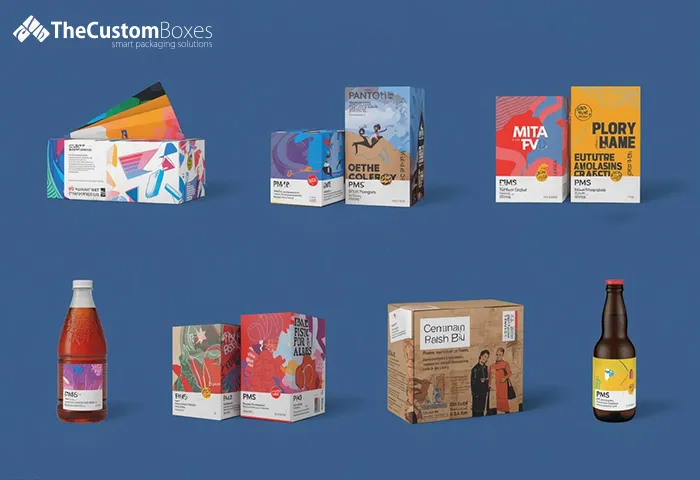
The PMS system is able to provide a more professional and pleasant look at packaging. PMS metallic and neon shifted to the luxury brands, where metal succinctly made the luxury feel. PMS colours assure a sharper, more solid finish in the custom packaging. This makes the packaging prominent and affords the product a high shelf bulwark. PMS would normally be used in brands that would want their logo, main brand colours, and any major design measurements to show quality in packaging design. PMS printing is also usable to enable small businesses to compete, as they appear to have a high-end look without incurring massive expenses.
-
PMS in Seasonal Packaging
A lot of brands conduct seasonal packaging with the help of the Pantone colour range. An example may be a coffee shop wherein the warm autumn colours turn to October or the bright pastels in spring. PMS assists them in getting the identical seasonal shades annually. This makes the season and the product have a great association in the mind of the customer. Seasonal colours are able to stimulate the sales as the products appear fresh and timely. The customers usually associate some colours with emotions or even events, such as Christmas and the colour red or the colour pink and Valentine's Day. In PMS the precise tone can be rolled over on a year-to-year basis. This builds trust and makes customers look forward to the brand’s seasonal designs. It also helps create a tradition that customers remember and expect.
-
PMS in Global Branding
Large companies sell products worldwide. A bottle of soda manufactured in one country ought to be of the same colour as that sold in other countries. The same PMS code can be used by the factories located in the various corners of the world with Pantone PMS. This maintains the brand image the same wherever the products are sold. Global branding needs this level of accuracy to maintain customer trust. A small change in shade can make a product look fake or low quality. PMS also helps when products are made on different printing machines in different regions.
-
Special Effects with PMS
PMS inks are not limited to basic colours.This can be applicable in the custom packaging design, which must declutter the shelves of the stores. These special effects will be able to bring excitement into the packaging or make it feel more premium. As an illustration, metallic PMS can be used in gold to provide elegance, and neon green can be used to provide a modern and bold impression. Special PMS shades also have durability and are less fadeable. This is of significance to those products that have to remain lively on the shelf for months. Customers can conveniently be impressed by the brands that have invested in unique PMS effects.
Tips for Choosing PMS Colours
When picking PMS colours for your custom printed boxes, think about how they will look in real life. He or she should always refer to a physical swatch book, as colours on-screen can appear differently. Also, test the colours on the actual material you want to print on so that they can remain true. The appearance of colours can also be transformed through lighting; hence, look at samples under the light the product will be shown to customers. Think about PMS colours that you choose in combination with the other design. Such as a bright colour could be awesome on its own, but it may conflict with some patterns. To prevent such mistakes, it is a good idea to work with a professional designer. There is no harm in taking time to select the proper PMS colours because you will have to pay again to reprint.
PMS for Limited Edition Products
A lot of brands produce limited edition products with exclusive packaging. PMS ensures that such colours are distinctive and unforgettable. The customers can feel special and collectible when the product is produced with a rare PMS colour. There is lots of buzz to be built around limited edition colours that may prompt quick purchases. These designs will be viewed by the customers as special gifts. PMS also enables a brand to maintain a unique colour within the entire range available in the limited edition. This makes sure that each package feels like it belongs to one unique collection. It further helps in encapsulating the difference in the product with the ordinary versions, hence making it valuable to consumers.
Consistency Across Multiple Printers
Sometimes, a company works with more than one printer to meet deadlines. Without PMS, each printer might produce slightly different shades. The Pantone Matching System prevents this by giving everyone the exact same colour target. This is especially important for large orders that are split between multiple facilities. Without PMS, a batch of packaging might have mismatched colours that harm the brand’s image. By using the system, all printers can follow the same precise colour recipe. This keeps the look of the packaging uniform and professional, no matter where it is produced.
Conclusion
The Pantone Colour Matching System is not just about pretty colours. It is about trust, quality, and recognition. Brands that use PMS ensure their colours stay the same across every type of print. This makes them look professional and reliable. Whether you need custom packaging for coffee, cosmetics, or clothing, PMS colours can make your brand stand out. With over 2,161 colours to choose from, the possibilities are endless. Our expertise in PMS printing will ensure your products shine with perfect colour every time. So grab this opportunity and order now!
FAQ's
Why is PMS important for brand colours?
PMS ensures that your print colors will never vary. This creates customer confidence and maintains your brand recognisability on all forms of packaging and other marketing products.
Can PMS colours be printed digitally?
Advanced digital printers, at least some of them, can simulate PMS, and it is not such a perfect match. True PMS printing involves applying special pre-mixed spot inks to deliver as accurately and as brightly as possible.
How do I choose a Pantone colour for my packaging?
To view the appearance of each colour in print, you should have a Pantone swatch book. Choose a PMS code with your brand style, and that will be fine when used in conjunction with the rest of your packaging.
Can PMS colours be used on all packaging materials?
Yes, PMS colors can be stuck on paper, plastic, fabrics, and other things. Printers make adjustments to the printing ink formula to ensure consistency in the colour, especially on various paper materials, to provide uniformity and a professional look for your packaging
Most popular post
Premier American Manufacturer of Packaging and Custom Boxes
Experience the ease of creating and ordering custom boxes and affordable packaging online with the Custom Boxes. Contact us today to discover how we can turn your packaging vision into a reality.

Payment & Security
![]() No Hidden Charges
No Hidden Charges
![]() Money Back Guarantee
Money Back Guarantee
thecustomboxes.co.uk online guarantee the privacy of all the customers and never share their personal information with third parties. For more details read our Privacy Policy.